It can be difficult to interpret Excel workbooks that contain a lot of data. Charts allow you to graphically represent your workbook data, which makes it easier to visualize comparisons and trends. Excel has several different chart types, allowing you to choose the one that best fits your data. To use charts effectively, you need to understand how different charts are used.
What is Chart Template?
Apart from chart types, you need to understand how to read charts. A graph contains several distinct elements or sections that can help you interpret the data.
-
Chart Title
The title should clearly describe what is depicted on the chart.
-
Vertical Axis
The vertical axis, also known as the y axis, is the vertical portion of the chart. Here, the vertical axis measures the value of the column. In this example, the measured value is the total sales for each genre.
-
Horizontal Axis
The horizontal axis, also known as the x axis, is the horizontal portion of the chart. Here, the horizontal axis identifies the categories on the chart. In this example, each genre is assigned its own group.
-
Data Series
A data series consists of data points that are linked in a graph. In this example, as we can see in the legend, the yellow column represents net sales in February.
-
Legend
The legend identifies each data series that represents its respective colour chart. In this example, the legend identifies the different months on the chart.
How to Create Your Own Chart with Chart Template on Excel?
-
Step # 1: Select the cells you want to chart
You have to include column headings and row labels. These cells will be the data source for the chart.
-
Step # 2: From the Insert tab, click the desired Chart command
In our example, we will select Column
-
Step # 3: Select the desired chart type from the drop-down menu
-
Step # 4: The selected chart will be inserted into the worksheet
If you are not sure which chart type to use, the Charts Recommended command will suggest several different charts based on the data source.
-
Step # 5: Customize
After inserting the chart, there are a few things you may want to change about how your data is displayed. It’s easy to edit graphic layouts and styles from the Design tab.
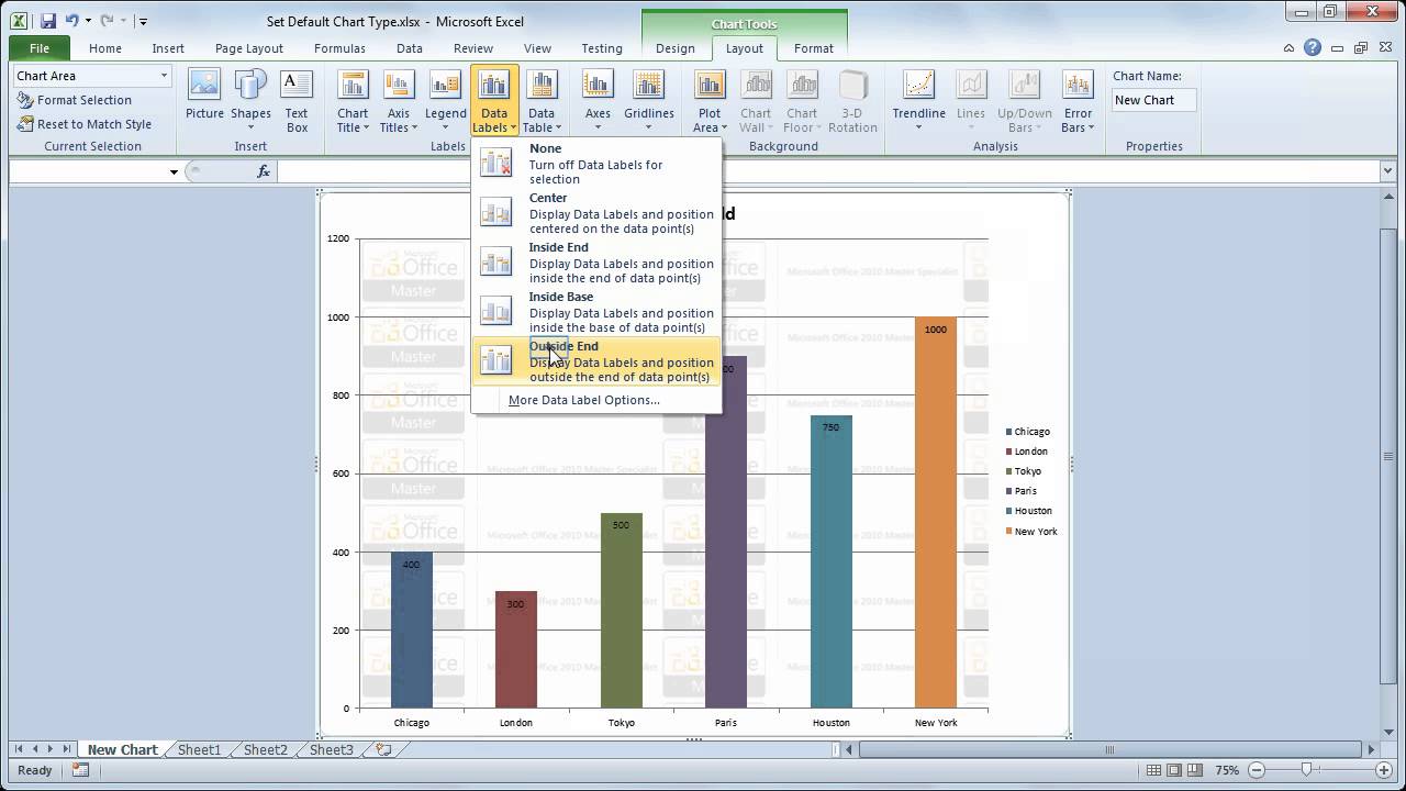
Excel allows you to add chart elements such as chart titles, legends, and data labels to make your charts easier to read. To add chart elements, click the Add Chart Element command on the Design tab, then select the desired element from the drop-down menu.
To edit graphic elements, such as the graphic title, just double-click the placeholder and start typing. If you don’t want to add individual chart elements, you can use one of the layouts provided by Excel. Simply click the Quick Layout command, then select the desired layout from the drop-down menu.