Visual representations play a crucial role in conveying information effectively and engagingly. One such visualization tool is the 3D pie chart, which presents data in a visually appealing manner. With its added dimension, the 3D pie chart template offers a dynamic and interactive experience, making it a popular choice across various industries. In this article, we will explore the versatility of 3D pie chart templates and their potential applications in different contexts.
- Enhancing Data Representation
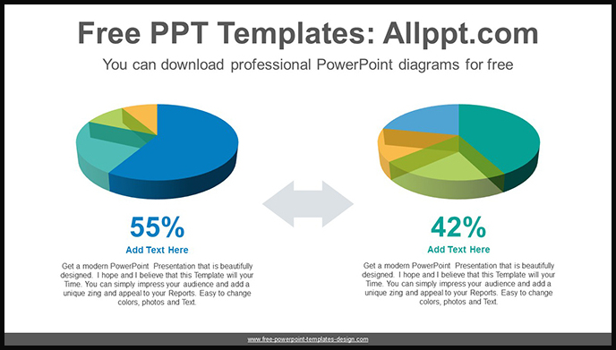
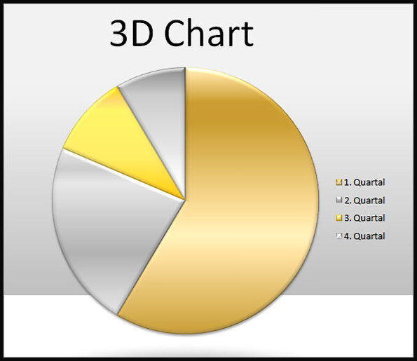
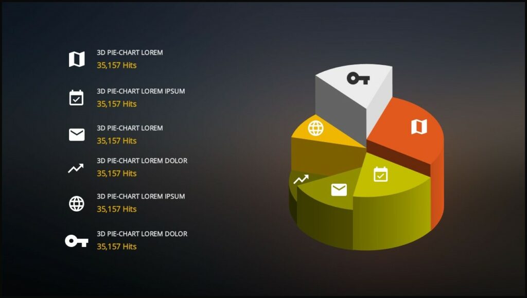
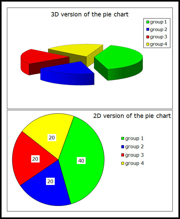
3D pie chart templates provide a unique way to represent data, adding depth and dimension to traditional pie charts. By incorporating the third dimension, these templates allow for a more immersive visualization experience, enabling viewers to perceive the proportions of data segments more effectively. The added visual appeal of the 3D pie chart template helps capture attention and can make complex information more accessible and understandable.
- Creating Impactful Presentations
When presenting data to an audience, it’s essential to make a lasting impression. 3D pie chart templates offer an excellent solution for creating visually stunning presentations. The added depth and perspective provided by the 3D effect make the charts stand out and capture the audience’s attention. By using vibrant colors and customizable designs, these templates enable presenters to create impactful visuals that leave a lasting impression.
- Sector Emphasis and Exploding Slices
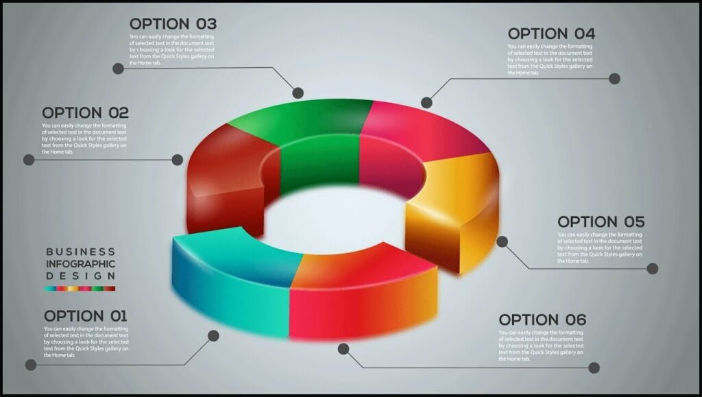
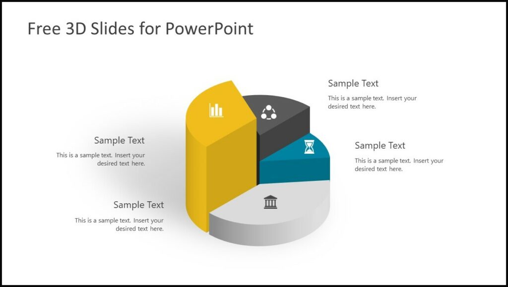
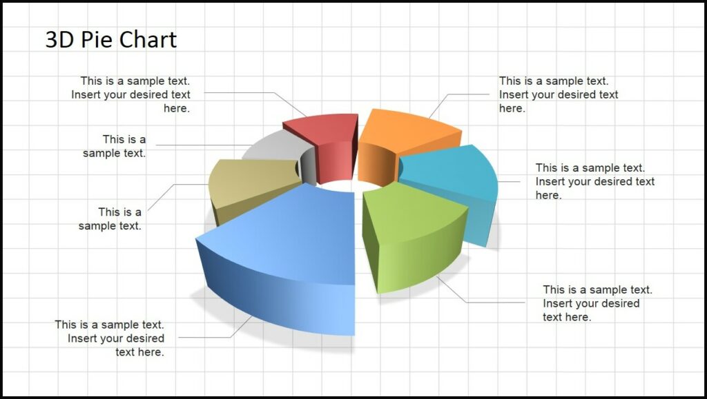
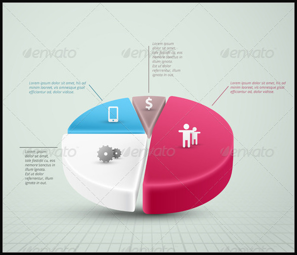
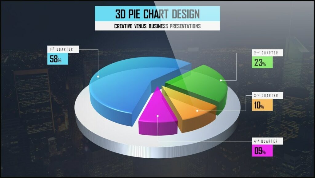
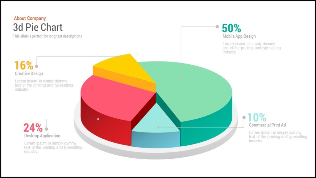
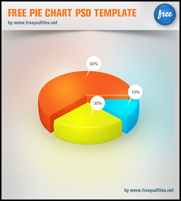
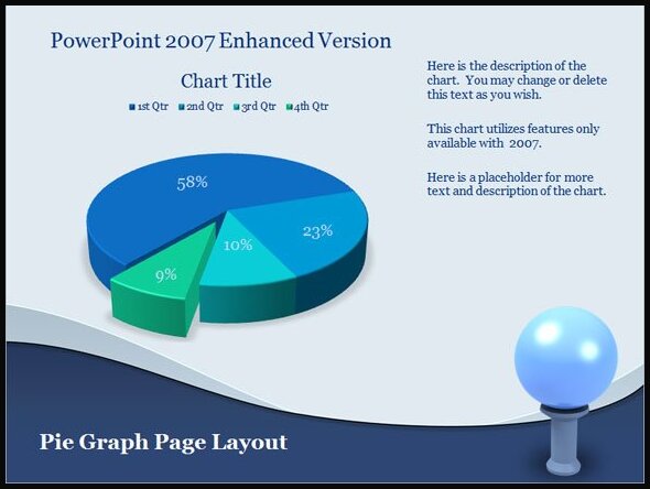
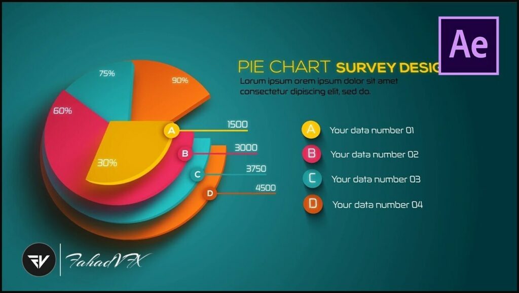
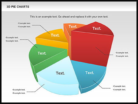
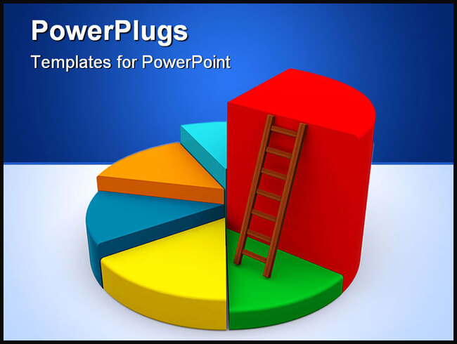
One advantage of 3D pie chart templates is the ability to emphasize specific sectors or data points. By pulling a particular segment forward or outward, presenters can draw attention to a specific data point and highlight its significance. This feature proves particularly useful when trying to convey the importance of a specific category or when emphasizing a particular trend or pattern within the data.
Additionally, 3D pie chart templates often provide the option to explode or separate slices from the rest of the chart. This separation enhances the visual impact and makes it easier for the audience to focus on individual elements. Exploding slices is an effective technique to highlight a specific section or draw attention to a particular data point within the chart.
- Application in Various Fields
The versatility of 3D pie chart templates makes them suitable for a wide range of fields and applications. From business reports to educational presentations and marketing campaigns, these templates can be adapted to suit various purposes. Sales and marketing teams can utilize them to present market shares, customer demographics, or product breakdowns. Educational institutions can employ 3D pie charts to showcase student performance or illustrate statistical data in a more engaging way.
Conclusion
3D pie chart templates offer a visually captivating and versatile method for presenting data. By adding depth and dimension to traditional pie charts, these templates enhance data representation and create impactful visual experiences. Whether it’s for business, education, or any other field requiring data visualization, 3D pie chart templates prove to be a valuable tool in conveying complex information effectively and engagingly. With their customizable features and ability to emphasize specific data points, 3D pie chart templates continue to play a significant role in creating visually stunning and informative presentations.
FAQ about 3d pie chart
Q: What is a 3D pie chart?
A: A 3D pie chart is a type of data visualization that represents data using a circular graph divided into sectors. Unlike traditional 2D pie charts, 3D pie charts add a third dimension, making the chart appear as if it has depth. The size of each sector represents the proportion or percentage of a specific data category relative to the whole.
Q: How does a 3D pie chart differ from a 2D pie chart?
A: The main difference between a 3D pie chart and a 2D pie chart lies in their visual presentation. While a 2D pie chart is flat and appears on a two-dimensional plane, a 3D pie chart adds depth to the chart by simulating a three-dimensional perspective. The 3D effect can make the chart visually more appealing and engaging.
Q: What are the benefits of using a 3D pie chart?
A: 3D pie charts offer several benefits, including:
- Enhanced visualization: The added dimension provides depth and perspective, making it easier to perceive the proportions of data segments.
- Visual appeal: The 3D effect adds an aesthetic appeal, making the chart visually striking and capturing viewers’ attention.
- Emphasis on specific sectors: The 3D format allows for emphasizing particular data segments by pulling them forward or outward, highlighting their significance.
- Impactful presentations: 3D pie charts can create visually stunning presentations that leave a lasting impression on the audience.
Q: Are there any limitations or considerations when using 3D pie charts?
A: Yes, there are a few limitations and considerations to keep in mind when using 3D pie charts:
- Distorted perception: The 3D effect can sometimes distort the perception of the data. The depth and angle can make it challenging to accurately compare and interpret the sizes of the sectors.
- Data complexity: 3D pie charts might not be suitable for displaying complex or large datasets with numerous categories. The chart can become cluttered and difficult to interpret.
- Accessibility: Some individuals with visual impairments or color vision deficiencies may find it challenging to interpret 3D pie charts accurately.
- Misrepresentation: It’s crucial to use 3D pie charts responsibly and avoid distorting the data or misrepresenting information. Always ensure that the chart accurately reflects the data being presented.
Q: How can I create a 3D pie chart?
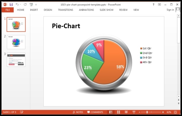
A: There are various software tools available, both online and offline, that can help create 3D pie charts. Popular options include Microsoft Excel, Google Sheets, and dedicated data visualization software like Tableau or Adobe Illustrator. These tools provide pre-designed templates and features to customize the appearance of the chart, such as colors, labels, and exploding slices.
Q: In which contexts are 3D pie charts commonly used?
A: 3D pie charts find applications in a range of contexts, including business presentations, marketing reports, educational materials, and data analysis. They can be used to display market shares, demographic breakdowns, sales figures, budget allocations, survey results, and more. However, it’s important to consider the specific requirements of your data and audience before deciding to use a 3D pie chart or exploring alternative visualization options.